Prev Article
Local newspapers are top for trust
Next Article
Digital's downfall is print's gain
Insight
27 . 05 . 21

Made you look!

Words by: Print Power
The infinite possibilities in enhancement and special effects can get your print campaign noticed and make it stand head and shoulders above the pack.
2. Fabergé_01_LO.:embossingjpg.jpg

Have you ever marvelled at the beauty of a digital ad? Probably not. A print ad or a piece of creatively produced print however, is guaranteed to hold your gaze. It’s the magpie in us. That instinct to covet the shiny, the beautiful, the dazzling and the vibrant. And when you hold a piece of print in your hands, its potency lies in the fact that it’s visually captivating, piques your interest and forges a more profound connection between you and the brand.

It’s no wonder then, that brands fighting for engagement are fuelling the demand for new technologies that create clever special effects in print. In response, printers are continually innovating to create ever-more eye-catching enhancements that are elevating print to art-like heights. It’s these effects that transform print from standard to extraordinary – using everything from metallic and pearlescent finishes to fluorescent and glow-in-the-dark. And that’s before you even get in to additional haptics you can add to print afterwards to make them extra smart.

1. Centrale_01_LO.debossingjpg.jpg

One printer pioneering its own finishing techniques is the UK and New York-based Kingsbury Press. ‘Our aim is a simple one, to create a masterpiece,’ states their website. ‘To use our skill, experience and craftmanship to transform every project into a work of beauty.’ And that’s evident in their portfolio of magazines, brochures, books and marketing material for luxury brands. They create covetable pieces for high-end real estate lifestyle and hotel brands like 22 Bishopsgate in London, De Beers and The Royal Atlantis Resort in Dubai.

Director Robert Layton explains that as well as offering offset printing effects like screen rulings (the number of screen lines, or lines per inch. The higher the lines per inch, the greater the detail), stochastic screening (gives you lifelike tonal representations), coatings like drip-off (lets you coat specific parts of an image in high-gloss UV), and metallic embellishments, Kingsbury has also invested in technology to go further with enhancements in-house.

‘We developed a product called K-Bind,’ he says, ‘a lay-flat binding method that avoids an obvious fold and stops images or words getting lost in the gutter. Then we have KolorEdge that allows any Pantone colour to be used on the edges of books, brochures, invites and business cards. The same machine can foil gilt metallic colours. We're trying to bring that element of surprise and luxury to a product,’ says Robert. I saw something on LinkedIn yesterday that said luxury packaging is often more powerful than the product it contains.’

Without doubt these enhancements mean more marketing spend, but agencies shouldn’t underestimate the gains made in terms the impact these special effects will add to their print campaign. In fact, the cost doesn’t have to be prohibitive, and it’s more accessible than many realise. Kingsbury Press also attract mass-market customers who are after the same appeal. ‘Because we have the technology in-house, we attract a diverse range of clients. If you don’t innovate, you don’t survive. Innovating allowed us to get market share in a decreasing marketplace.’ If more marketers were made aware of innovation in printing, they would boost the creativity, effectiveness and ROI of a campaign no end.
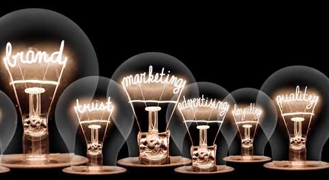
The world of digital printing is ever-innovating too.

‘Enrichment in today’s world can be a hundred and one things,’ says Kevin O’Donnell, head of marketing, graphic communications at Xerox, ‘from the paper you print on and something that’s tactile and has feel and form, to the way it’s folded, or a smell that’s put into it to evoke a sensation. Enrichment in digital printing is the finishing. It’s also in the data that you can tap in and use to drive design. We’ve introduced a number of technologies that allow you to print more than just CMYK. We call it CMYK Plus Technology. Or Beyond CMYK.’

Print Power Xerox Pink Solutions_LR.png (1)

One of these is the Xerox Iridesse Production Press that uses six inline dry ink print stations – CMYK and two optional additional colours to choose from - gold, silver, white, clear or fluorescent pink. It’s Xerox’s range of fluorescent colours that really pack a visual punch. ‘We have fluorescent pink and yellow and another device that has fluorescent cyan, magenta and yellow. We can embed fluorescence under CMYK images, so if you shine a UV light onto it, you reveal a set of secret messages. I did a magazine cover for Print Solutions in the fluorescent pink. They were so impressed with it, they changed the title of the magazine for that edition to Pink Solutions.’

Historically, the cost of printing colours like these would have been sky high. ‘We’ve democratised the use of these special effects and colours. Even at entry level you can achieve these effects. All of our products give you access to effects that were a bit too labour-intensive and expensive in the past.’

One of the creatives that Kevin and Xerox has collaborated with is Ben Glazier. Glazier Design produced an invitation and other printed material for Stephen Hawking’s interment service at Westminster Abbey using CMYK, silver and clear. For guests at the funeral, they minted a coin and the accompanying certificate had clear print – Professor Hawking’s thumbprint - as a security measure. One of the coins was put into his grave and will be there for the rest of time.

‘Until now, if you wanted any kind of metallic effect, you either had to litho print (wet ink) or add a foil, which had to be common for the whole run as it depended on plates or a block that you couldn’t change for each page,’ explains Ben. ‘Now imagine adding a new slot for toner before the CMYK and one after, into which you can add a digital toner that prints metallic gold, silver or white or clear. That means you can have one of these under the CMYK and one over. If you print silver or gold under, then CMYK, you get a metallic base layer with colour over it, which gives the impression of a metallic colour. With millions of CMYK colours to run over the silver to choose from, you effectively have a new range of millions of metallic colours. Then add a top layer – gold white or clear – and you have a way to add effects and embellishments on top.’

Ben believes it’s this ability to personalise that’s the game-changer. ‘This is toner, it’s digital printing, so it can be different on every sheet. Using variable data, you can mail merge a database and have every sheet come out with a different speciality effect. Names, dates, pictures – any content that can be selected in InDesign. Imagine if every issue of a magazine printed the recipient’s name on the cover, in ads and through the copy using variable data. Then imagine if it was in silver, gold or fluorescent pink. Could anyone ignore an ad with their name in hot pink or Dutch orange?’

CEO of the British Printing Industries Federation (BPIF) Charles Jarrold agrees. ‘I think what’s particularly key now is how print interacts with online. Print has got real strength in its ability to get your attention when it’s appropriate, targeted and produced beautifully. And that’s where innovation is really key. What’s important in our industry is that we develop and move forward alongside the continual change in technology.’